Metro Manila Community Quarantine - Day 96
It's hard to understand how we're tracking COVID cases since we've developed a variety of reporting methods at the city and national levels and they don't necessarily work together. And there are even reports that some of the national data doesn't quite link up with the local government data. How we're managing our response to a global pandemic with inconsistent data is beyond me, but it's what we have.
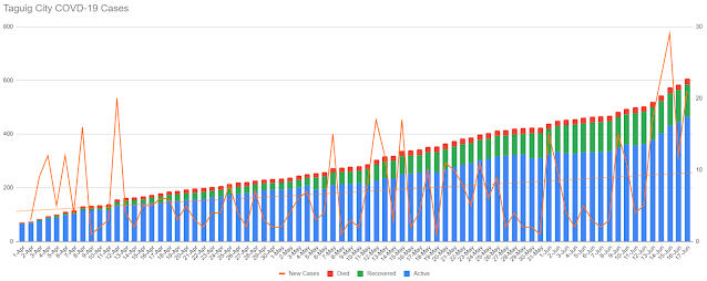
I'm already maintaining a tracker for the new "fresh" versus "late" case data reported at the national level, so I decided to make a side project out of trying to better understand the local government data for the City of Taguig, where we live, and in particular Barangay Fort Bonifacio, since the city-level updates breaks things down to the barangay level. The result is two charts with different time frames because barangay-level data didn't always have the same Recovered and Died data points but it's a start.
So looking at the chart above, the city level trend of new cases (the jagged orange line) isn't too promising given the upward trendline (the straight orange line). The case rise doesn't seem to be distinctly impacted by the different quarantine phases experienced in the past few months, but then again we did have a lot of those "late" cases and our data is just sorted based on the date the test was processed and not necessarily the data the swab sample was taken.
Barangay-level data for Fort Bonifacio is a bit more optimistic since our daily new case numbers have remained low and a greater chunk of cases are now tagged as recovered (green) instead of active (blue). The trendline for new cases is a gentle downward slope for the most part, but it's not exactly time to relax our guard just yet. No one barangay is fully isolated from others and the risk of cross-infection remains.
But even this meager data analysis is somewhat reassuring to me since it at least helps me get a better understanding of where we stand in this fight against the disease. The data tells me that maybe I shouldn't be so nervous about going around BGC proper as our overall case trend seems to be moving in the right direction, but venturing to other parts of BGC may not be quite ideal.
And this whole data exercise began with me wanting to see what the DOH was trying to achieve by segregating "fresh" versus "late" cases in their daily reporting. In the beginning, it probably helped show that most of the cases were part of the backlog (maroon bars) and counted for more of the cases. But when you focus on the trend of "fresh" cases, that's a line that continues to go up, so the DOH can't hide behind the backlog story for now. Then we can go back to a more holistic national reporting approach and just talk about the new cases as they come in and not bother with this segregation. And since the backlog is supposed to be a temporary concern, then an upward trendline for new cases is pretty much inevitable.
On the whole, the overall linear trend is a downward slope for total new cases per day at the national level, but if we shift to a moving average trend, the recent reports should give pause as we may be on a bit of a rise again.
These are hardly the most complicated data visualizations that could best depict the progression of this disease, but I'd like to think they're easy enough to understand and provide a clearer picture of different aspects of the ongoing infections. If only more official data visualizations were clearer. Then I wouldn't need to reformat government data into my own tables and charts.


Comments
Post a Comment